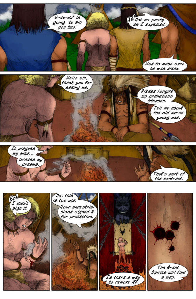
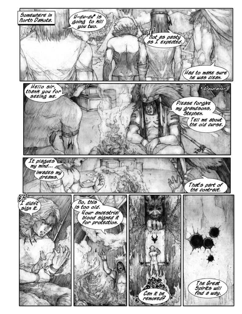
I’m now the proud momma of a full-fledged comic book! I couldn’t be more ecstatic! The Kickstarter campaign didn’t get funded, even with a #make100 option available. But, that doesn’t matter, I got an opportunity to get a super small print run funded and jumped on it.
My initial thoughts on getting the pages updated for printing were optimistic. A few tweaks in the placement of the word bubbles would help it flow from the screen to paper, but I was in for a rude awakening. I tried to drag and drop the file into the handy template I created in Photoshop with Advanced Print & Finishing’s specifications. It was off, but cutting and resizing it to fit wasn’t an issue. Once that was finished, I checked my notes from a few of the comic followers on webtoons to make sure I kept them in mind while working.
The biggest one came from Alexandria Thompson after I asked for any suggestions on one of the posts,
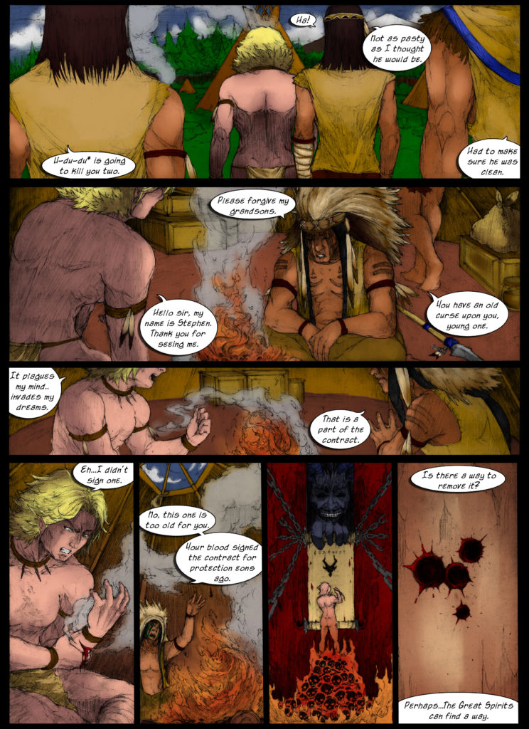
“My only suggestion is the dialog. It’s difficult sometimes to follow the story and dialog from panel to panel. But the art, the plot, the characters are all so cool!! But it’s just hard for me and my friends to try and figure out what’s going on. They’re voodoo hunters of sorts, right? I can’t wait to see how the relationships evolve! A mature fantasy romance is right up my ally!”
The main issue of the dialog not flowing was pulling the reader out of the story and making them work to understand what order to read the bubbles in. That is a major writing faux pas and needed to be corrected for the people online before the pages were sent to the printer. As an avid writer of just about everything, I blamed my inexperience since some pages were made over two years ago. But, I’d learned a lot since their publication and should have corrected them sooner.
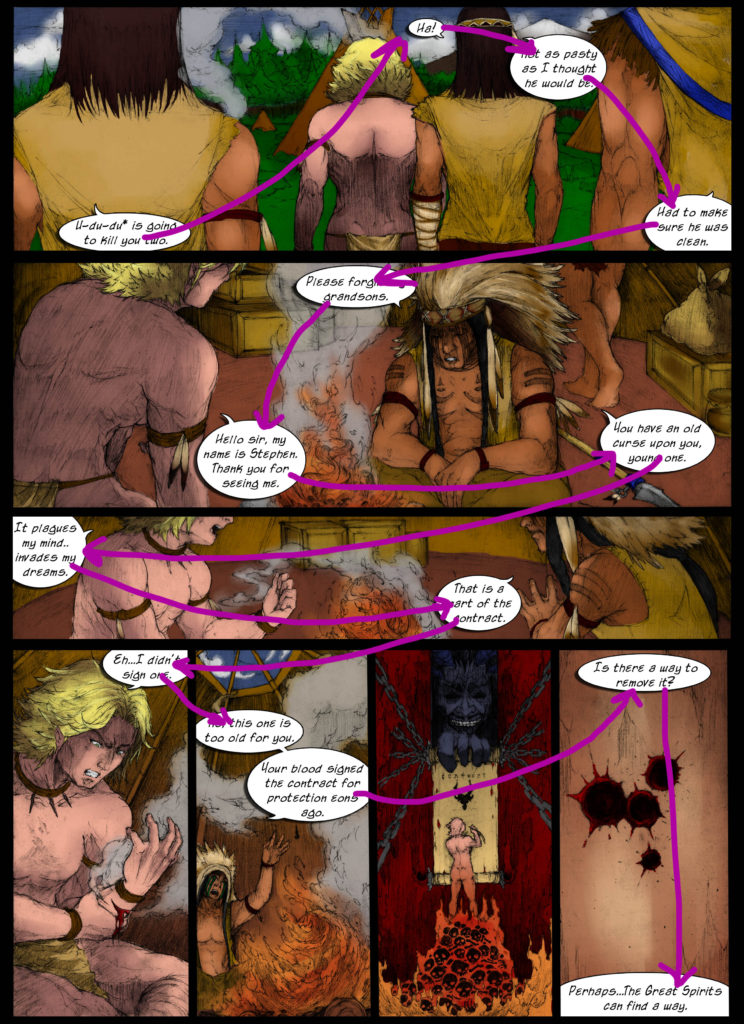
No need to beat up myself, just get to work. I pulled up the old page and outlined the word bubbles in the order that fit the script.
I had to post a query on Instagram while I was at it.
You’d think I hadn’t read as many comic creation books and blogs as I have. I was making rookie mistakes like I was new to the game. But, I realize I was submerged in the story and world, I knew who was saying what and when they said it. That knowledge set blinders on my face and I plowed through lettering the comic with no regard to the reader. How could they know what was going on? I’ve been sending them into a word search with distracting pictures in the background.
The only thing that saved the folks of Tapastic and Webtoons was the ease of posting a super long comic page.
It had placated me and put me to sleep. Now, I have awakened into a nightmare, which could make me dread weekends. Filled with correcting old mistakes, without making something new and fun. Plus, what was I thinking when I put a drop shadow on everything!
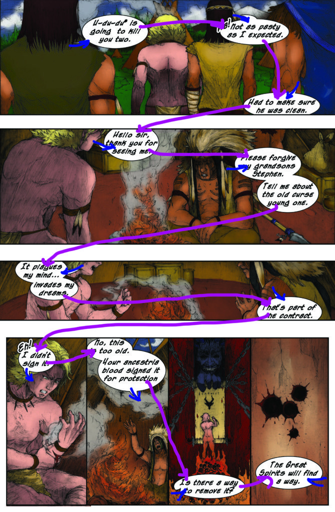
I had to find a better way for them to speak to each other. More conversational, but still telling the story and getting to the point. I also noticed that my bubbles weren’t very uniform, so I pulled out my notes from Nate Piekos of Blambot. The main thing here was to make the text uniform and bold so that it would stand out. The bubble sizes needed to be adjusted to enough room for the words to look comfortable, not cramped. With that issue fixed, I checked the layout again and had a much better outlook.
To be absolutely sure, I searched for any more recommendations to make the words flow better with the art. I ran across an article by Chris Oatley called Comic Layout Tutorial: Comic Balloons & Clarity. It was very informative and made a really good point about the bubble tails or arrows being signposts for the readers.
“Your tails also need to point in directions that push and pull the reader throughout the page from one panel to the next in the appropriate order.”
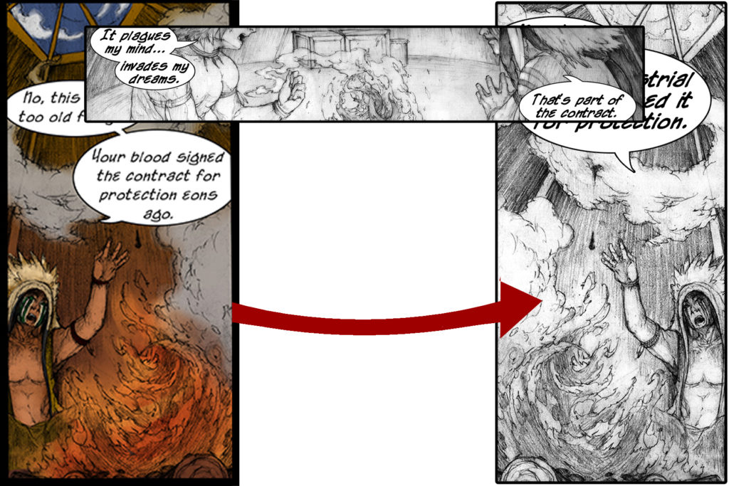
We were on the road now with headlights on! It was time to work, and the remodel took some time but had a nicer outcome. Now, the word bubbles are in place and their tails guide the eye along with the art. Then, screech on panel five! There was something that jumbled the eye and pulled me out of the art. How the heck does that happen? The original art made the reader have to process a turn in perspective that wasn’t necessary. Up until this point, Stephen has been on the right and the Chief on the left. Now, the camera moved a full 180 and that was a no-no.
The angle was flipped and after some free transform action, panel five was corrected.
When I worked on the printing conversion, I was hopeful in getting a completed Kickstarter for a color print run. That wasn’t the case, so I had to make a player decision, get some prints with black and white interiors or go to Momocon with poster prints only. Having only posters at my first convention was not going to fly, I needed some prints and I personally love Michael’s pencil lines, so black and white it was.
After some more review, the page finally looked to be in order and finished. Not perfect, because after I got over my high of having a printed copy VuDu Legends in my hands, I saw an issue. Not going to tell you what it is, because, at this point, it’s a little less than a ‘meh’ issue. That brings me to another point, finished not perfect. Jake Parker is a fantastic artist that I follow on Facebook who put out a wonderful ASA (Artist Service Announcement) that I have been keeping at the forefront of my mind whenever I do my work. When I get bogged down in the details and nothing seems to be working out, I figure out if it is good enough to get my point across and move on. The project needs to get done and focusing on the first few pages for days on end isn’t going to help in that need.
After all of the crazy that went into creating my first printed comic book, I still want to dive into the next. As long as learning keeps evolving and finishing beautiful projects is the plan of action, it can happen.
Are there any projects you are working on that could use some more tweaks that can classify it as finished?
